AI Video Generator
 AI Image to Video
 AI Text to Video
 AI Image Generator
 AI Image to Image
 AI Text to Image
 AI Video Generator
 AI Image Effects
 Bring your imagination to life with powerful Viyou AI tools.
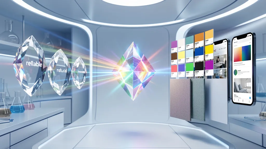
 Contents
Let’s be honest: have you ever spent what felt like hours staring at a color picker, trying to choose the “right” colors for your brand? When briefing a designer, do you find yourself using vague terms like “more premium” or “warmer,” only to receive concepts that still don’t feel quite right?
In branding, color isn’t just decoration—it’s a strategic asset. It can evoke emotion, communicate your value, and set the tone for every piece of visual content you create… all in under half a second. But the traditional process of choosing a palette is often abstract, subjective, and inefficient.
This guide will show you a systematic way to use Viyou AI as your “color scientist” and “visual curator.” You’ll learn how to transform fuzzy brand keywords into a precise, harmonious, and story-driven color system and mood board, laying an unshakable visual foundation for your entire brand world.
The Core Formula: From Vibe to Precision System
A professional brand palette is more than one primary color. It’s an ecosystem of primary, secondary, accent, and neutral tones, where each hue carries specific meaning and logic. Build yours with this framework:
“Brand Personality + Industry Context + Color Emotion + Texture + Application Preview”
Here’s how to translate that into an AI prompt:
- Brand Personality: 3-5 adjectives (e.g., bold, inclusive, digital-native).
- Industry Context: Your field (e.g., fintech, sustainable beauty, edtech)—this grounds your colors in reality.
- Color Emotion: The overall feeling (e.g., trustworthy calm, energetic serenity).
- Texture & Finish: Define the “surface” (e.g., matte, velvety, liquid metal, translucent).
- Application Preview: Request to see colors on specific materials or in simple scenes.
Your Go-To Prompt Formula:
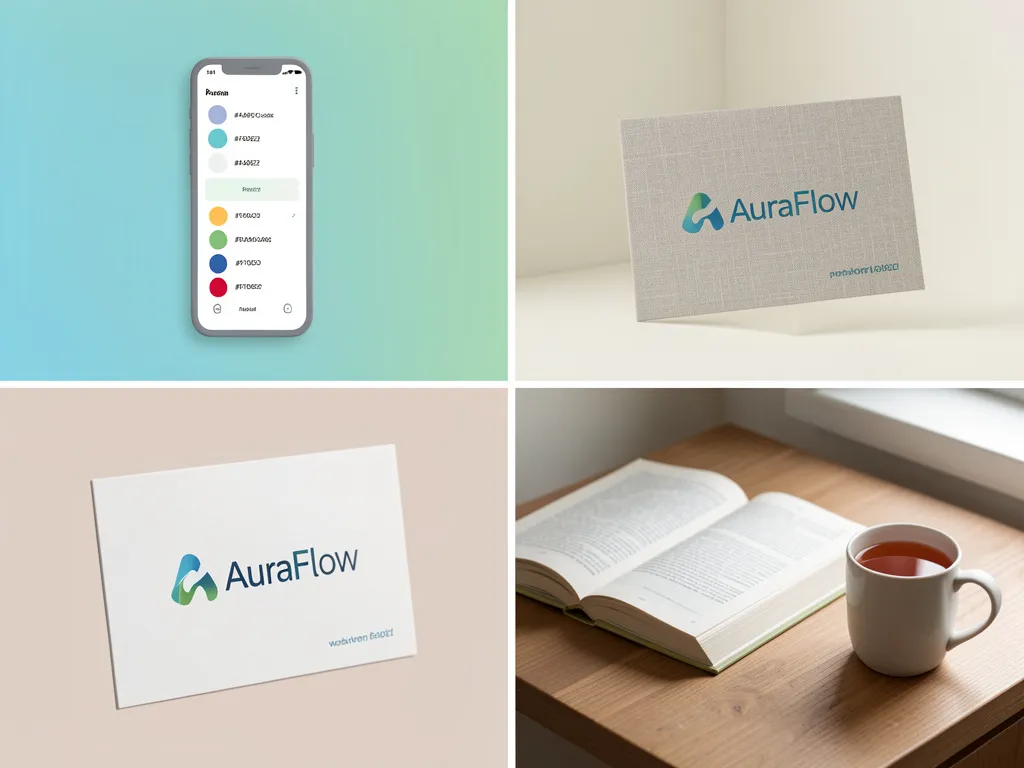
Create a complete brand color system for a [Your Business Type] called [Brand Name]. The brand personality is: [Adjective 1], [Adjective 2], [Adjective 3]. We operate in the [Your Industry] space. The overall color emotion should balance [Feeling 1] with [Feeling 2]. Please provide a palette with 1 primary color, 3 secondary colors, 1 accent color, and 2 neutrals. The finishes should lean towards [Texture, e.g., soft matte, fine gradient]. Finally, apply these colors to the following mood board scenes to show them in context: 1) A subtle gradient background on a mobile app screen, 2) A solid logo on a linen brand card, 3) A serene corner with an open hardcover book and a mug of tea.
3 Classic Brand Color Narratives (With Prompts You Can Steal)
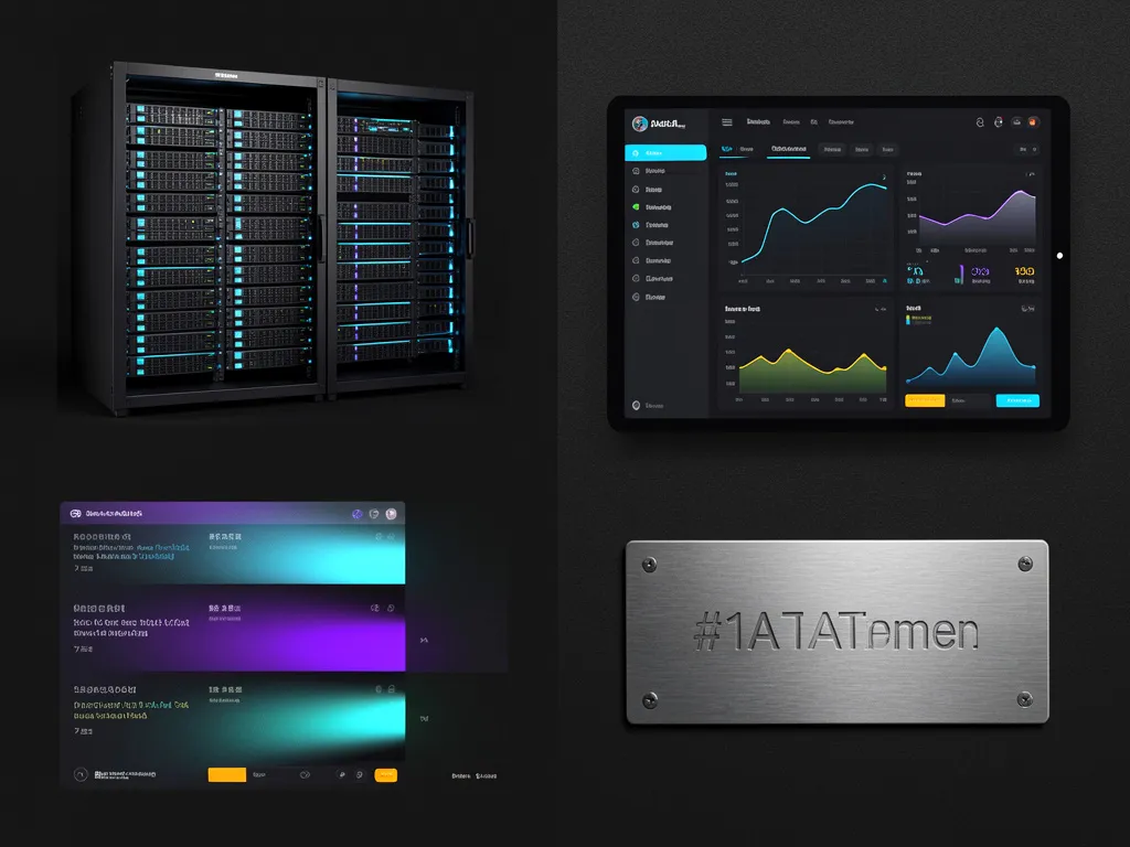
1. The Tech & Trust Narrative
- For: SaaS, FinTech, Consulting, Web3.
- Goal: Communicate logic, precision, security, and a forward-thinking feel—without being cold.
- Your Prompt:
Design a color system for an enterprise data security platform. The brand is: utterly reliable, cutting-edge, transparent, powerful. We want to move beyond the typical navy/black of cybersecurity. Explore a primary color that blends "deep graphite grey" with an "electric blue." Pair it with a secondary palette of gradients that suggest "data flow" (e.g., blue-purple to cyan). The accent should be a high-visibility "signal color" (like a bright amber). The overall texture should mimic the "subtle glow of dark mode UI" and the "fine grain of anodized metal." Show the colors applied in a mood board featuring server rack lighting, a dashboard UI on a dark background, and an engraved metal nameplate.
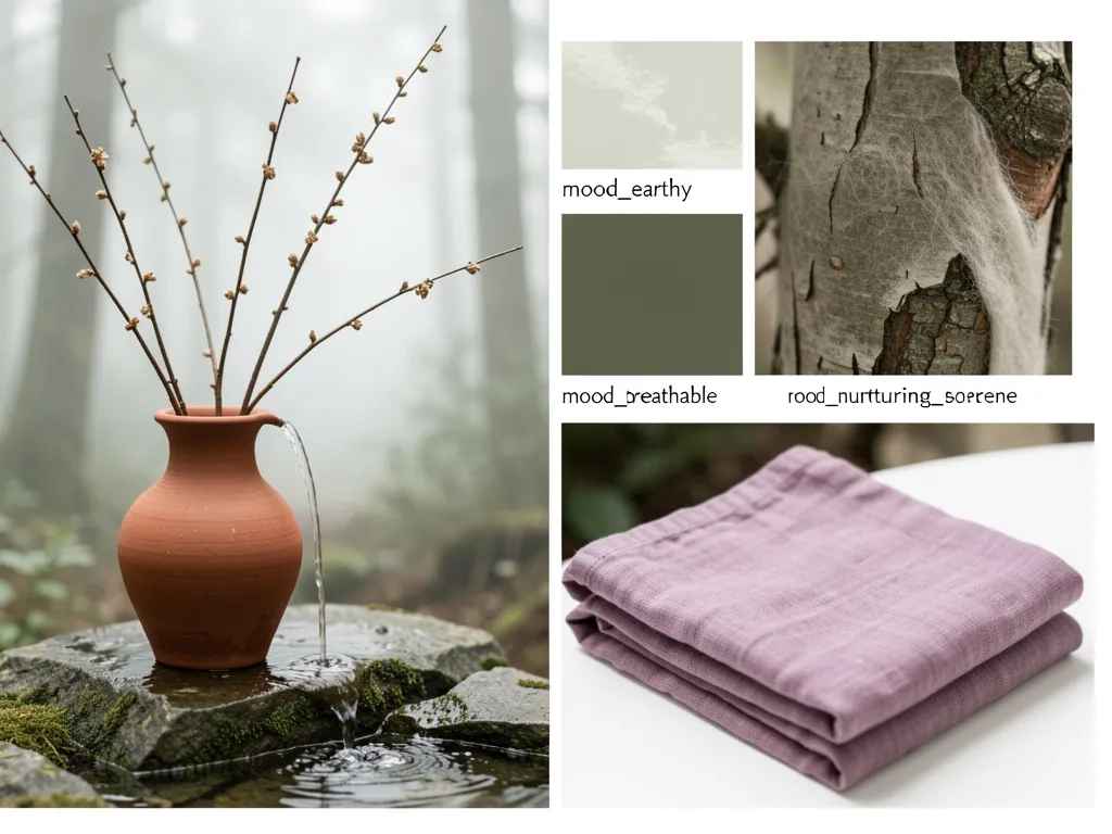
2. The Wellness & Nurture Narrative
- For: Health brands, yoga studios, organic goods, mindful living.
- Goal: Evoke nature, warmth, growth, and holistic balance.
- Your Prompt:
Create a color mood board for a forest bathing and mindfulness retreat brand. The personality is: earthy, breathable, nurturing, serene. Draw direct inspiration from "a misty morning forest"—think mossy greens, damp soil browns, soft stone greys, and the faint lavender of dawn. Avoid anything neon or harsh. For texture, aim for the feel of "hand-glazed pottery," "wet bark," and "soft merino wool." Generate a highly cohesive, desaturated natural palette and show it applied to a still-life scene: dried branches in a clay vase, water poured over a rough stone, neatly folded naturally-dyed linen.
3. The Creativity & Energy Narrative
- For: Creative agencies, fashion labels, art education, social apps.
- Goal: Spark inspiration, express individuality, radiate optimism and possibility.
- Your Prompt:
Design a vibrant color system for a Gen Z digital art collective. The brand is: hybrid, experimental, celebratory, inclusive. Avoid safe choices. The primary could be a bold "neon magenta" or "digital cyan." The secondary palette should have intentional, yet harmonious clashes—think "80s synthwave" or "glitch art" aesthetics. We need variants that work on both dark and light modes. Textures include "neon glow," "pixel grain," and "candy glaze." The mood board should show these colors in action on a graffiti-covered brick wall, a pixel-art animation on a retro CRT monitor, and the eclectic outfit of a street-style icon.
Pro Workflow: From Palette to Living Brand Guide
Generating colors is step one. Here’s how to turn them into actionable assets:
1. Build Your Color Spec Sheet: Use a color picker tool on your final AI-generated palette to capture the exact HEX (web), RGB (screen), CMYK (print), and PANTONE (spot color) codes. This is your universal language for designers, printers, and developers.
2. Define the Rules of Use: Based on your mood board, document in clear terms:
· Primary Color: For logo, major headlines, key CTAs.
· Secondary Colors: For information hierarchy, charts, backgrounds.
· Accent Color: For maximum attention only (price tags, error alerts, favorite buttons).
· Neutrals: For body text, borders, shadows—always ensuring readability.
3. Create Reusable Mood Board Templates: Save your successful AI prompts as templates. For any future sub-brand, campaign, or product line, simply swap the core keywords (e.g., from “serene” to “adventurous”) to instantly generate a new, on-brand color mood board. This ensures your visual ecosystem stays cohesive yet dynamic.
Related Blogs
The Final Takeaway
Color is your brand’s most fundamental emotional language. Using AI here doesn’t replace a designer’s eye—it liberates you from guesswork. It gives you a superpowered lab for “color experiments” based on a vast library of visual data.
You’re no longer just picking swatches. You’re becoming the architect of your brand’s emotional world.
Start the experiment now. Input your brand’s core words and witness the “alchemy.” When colors truly resonate with your brand’s soul, their power is undeniable.